WashU Medicine showcases art exhibits on a rotating quarterly schedule. On display in the Farrell Learning and Teaching Center 2nd floor Hearth, artwork in these rotating shows are medical or scientific by nature, St. Louis themed or produced by a member of the Washington University community.
2-D Exhibit
Lisa Young
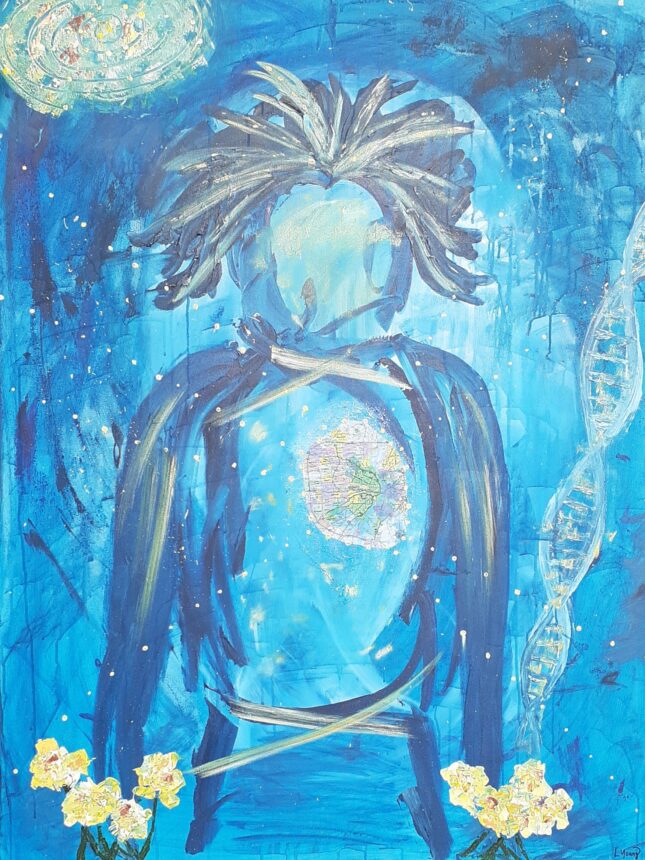
For St. Louis artist Lisa Young, painting is about trusting inner wisdom. She follows intuition as she mixes color, loads the brush and makes each mark.
Like the abstract expressionists of the 1950’s, she is driven by spontaneity and exploration at the canvas. She prefers the fast-drying quality of acrylic paint, so she can work energetically in layers.
Her tools of choice are foam brushes and palette knives, which encourage less constraint and more freedom in the creation of each piece.
She avoids representing images too literally, opting instead for an inspired flow that produces rich colors, dripping, creative texture, and her signature multi-colored lines.
Repeating themes include transcendence, nature as a mirror, and freedom of the human spirit.
Original paintings and prints available at https://www.lisayoungartist.com.
On display at FLTC through July 10, 2026.